Quantcast
Channel: Becca Clason - Lettering Artist & Stop-Motion Animator
Viewing all 110 articles
Browse latest View live

LÄRABAR

$
0
0
LÄRABAR hired me to create a few elaborate food lettering pieces to showcase the very few ingredients that they use to make their tasty bars. Role: Lettering artist, art director, photographer

CORIANDOLI LOGO

$
0
0
This logo was designed for Jordan almond company, Coriandoli, in Los Angeles owned by an Italian couple. The word "confetti" denotes candy-coated Jordan almonds, while the Italian word "coriandoli" means "paper confetti". The owners wanted a fancy-looking logo for fancy almonds, but they also wanted the logo to have some earthy roughness, like it had been drawn by hand, since the almond tree and almond blossom play such a large part of the product. Role: Lettering artist and Illustrator

HAVING PUN WITH FOOD

$
0
0
I combined chalk lettering with food lettering to make some silly messages on chalkboard. The chili design uses fresh jalapeño peppers, chili powder, dried chile de árbol, red chili flakes, and chalk. The carrot piece uses freshly chopped carrots, salt for drop-shadow accents, and chalk. I hand-crafted the letters, then added the chalk, and then finished styling the pieces. Role: Lettering artist, art director, photographer

WAFFLE LOVE

$
0
0
Waffle Love, a popular waffle food truck in Utah and Arizona, reached out to me to create a couple food lettering pieces for them. They wanted some fun, creative visuals to post to social media to inform their followers what their location schedule would be for all of their trucks. Using topping ingredients as well as the actual Waffle Love liege waffles, I created the word "schedule". The berry piece was the largest scale food lettering project I've created so far, measuring over two feel tall and almost four feet wide. Below is a process photo during the creation of the berry piece as well as the rough sketches I sent to the owner so she could approve my direction.

CRAFT THE LETTER

$
0
0
Crafter, blogger, and illustrator Brittany Jepsen of House That Lars Built and I collaborated on an Instagram series called Craft The Letter. Using craft materials, I created lettering of an appropriate word for the particular product, and Brittany styled the pieces. I then photographed them, and we posted one a day for two weeks in March 2015, encouraging our followers create their own word or letter using craft materials and post a photo of it using the hashtag #CraftTheLetter. Whoever created our favorite one would win one of my screen-printed posters as well as some craft supplies from Brittany. We had such a great response, and now there are over 400 photos on Instagram using that tag. Below are some of my favorites of the 14 pieces Brittany and I created.

WANDER POSTCARD

$
0
0
• • •This was my contribution to The Wander Postcard Project, run by Keenan Cummings, co-founder and creative director at Wander. Head over to the Wander Blog to download some high-res iPad and iPhone wallpapers of the postcards. "Life is either a daring adventure or nothing." -Helen Keller

TARGET

$
0
0
I was so excited when Target approached me to create three designs for their 2015 spring social campaign. They provided me with the copy and gave feedback on my product choices and design concepts. Copywriter: Kiera Jacobson Art Director: Kyle Gustafsen Concept, Shoelace Lettering, Styling, Photography: Becca Clason Below are a few behind-the-scenes shots during the making of these pieces, including some experimenting with honey to achieve a water look. Fun facts about the process: I created those "water" droplets with honey, I painted "It's like a bouquet of happy" using red fingernail polish, and I couldn't find enough bluish flowers to use for raindrops, so I spray-painted some white daisies to get a tinge of blue.

AMERICAN EXPRESS

$
0
0
I was commissioned by American Express to create my interpretation of their green, gold, and platinum cards for their Card Art social campaign. I was asked to create a stop-motion video of the cards using dimensional objects, and other than that it was up to me on what items to use and how to use them. For the green card, I decided to use Italian food: dried and fresh herbs, pine nuts, uncooked linguini, spices, and zucchini. For the gold card, I chose Indian food: yellow lentils, garbanzo beans, potatoes, lemons, ginger root, and spices. For the platinum card, I chose ingredients for French baking: black sesame macarons, a couple kinds of silver sugar sprinkles, sugar, eggs, measuring spoons, and wire whisks. Becca Clason handcrafted Platinum AmEx Card from Snyder New York on Vimeo. Becca Clason: Amex Gold card from Snyder New York on Vimeo. Becca Clason for American Express and their Card Art series: GREEN CARD from Snyder New York on Vimeo. Below are some behind-the-scenes photos for each of the card designs. I spent 8.5–10 hours creating each card design by hand without any use of outlining or stenciling, and then I very carefully removed all of the items while photographing the process. The removal and photography took 1.5–3 hours for each card. I then spent time cropping and editing all of the photos and strung them together to create the complete stop-motion video. Below are my rough concept and layout sketches for each of the cards. Agency: Alldayeveryday Account Coordinator: Taylor Tindall Senior Producer: Bailey Beckstead Senior Social Strategist: Natalie Paul

HANDCRAFTED RECIPES

$
0
0
Using ingredients from some of my favorite healthy dishes, I love to create fun, visual recipes by hand.


KELLOGG'S SPECIAL K

$
0
0

Becca Clason for Kellogg's Special K "Berry Amore" from Snyder New York on Vimeo.
I collaborated with Kellogg's to create a stop-motion video to spread the word on social media that Special K Red Berries Cereal now has more real berries in every box.

I did the photography, animation, hand-lettering, and post-production for the project. Music was added by VML.

Agency: VML
Creative Director: Suzanne Winn
Director of Client Engagement: Latha Armbandi
Social Channel Manager: John Kochmanski

THE WASHINGTON POST

$
0
0
I was hired to create the cover of The Washington Post Local Living section in July 2015. The cover coincided with the feature article about reducing sugar intake by eating more natural sugars from fresh fruit and juice, so I created reversed-out lettering by hand, using blueberries for the headline, and zest from lemons, limes, and oranges for the typographic shape of the Local Living masthead.

Art Director: Susana Sanchez


The printed paper

The final image I delivered

The sketch I delivered for approval I before I began creating with the fruit

Detail

Detail

Detail

RANDOM STOP-MOTION ANIMATION

$
0
0
Sometimes I make stop-motion videos just for fun.
A video posted by Becca Clason (@beccaclason) on Jun 25, 2015 at 7:16am PDT


A video posted by Becca Clason (@beccaclason) on Jul 6, 2015 at 6:53am PDT


Experimenting with fluffy little clouds #stopmotion #cottonballs #wind #clouds A video posted by Becca Clason (@beccaclason) on Aug 30, 2015 at 8:37am PDT

SABRA DIPPING CO.

$
0
0
I created the food typography for Sabra Dipping Co.'s social media campaign, which ran as sponsored posts on Instagram. The series aimed to dispel certain myths about hummus to encourage more households across America to incorporate hummus into their meals. The Martin Agency provided me with the copy for each of the hummus flavors, and it was up to me to create a sketch showcasing the concept. Based off of the approved sketches, I created a mix of still images and stop-motion animations using ingredients or items to hummus dippers.

Agency: The Martin Agency
Community Manager: Allison Walton
Account Manager: Ben Safchuk
Copywriting & Creative Direction: The Martin Agency

Food lettering, Styling, Photography, Animation:
Becca Clason
A video posted by Becca Clason (@beccaclason) on Sep 24, 2015 at 6:07am PDT

A video posted by Becca Clason (@beccaclason) on Oct 31, 2015 at 2:12pm PDT


Some detail shots of the designs


CITIBANK

$
0
0
During September 2015 Citibank ran a promotion benefitting No Kid Hungry. To advertise the promotion, I was brought in to create some food typography still photos and stop-motion animations done in various restaurant settings like a bakery, a southern BBQ place, sushi restaurant, Italian pizzeria, Mexican restaurant, and burger joint.

Agency: Publicis North America
Senior Producer: Katie Bartlett
Creative Director: Christopher Smith
Art Director: Chris Vanderhurst
Copywriter: Christopher Gelarden
Senior Art Producer: Veronica Williams

Lettering, prop sourcing and styling, photography, animation:
Becca Clason


Press play to watch the animations!
A video posted by Becca Clason (@beccaclason) on Sep 25, 2015 at 9:14am PDT

A video posted by Becca Clason (@beccaclason) on Sep 30, 2015 at 7:01am PDT

A video posted by Becca Clason (@beccaclason) on Oct 5, 2015 at 9:58am PDT

A video posted by Becca Clason (@beccaclason) on Oct 12, 2015 at 10:05am PDT


Some detail photos of the designs


TIME OUT NEW YORK

$
0
0
I was invited to create the cover for Time Out New York's annual 100 best dishes in NYC issue for October 2015. I lived in Manhattan for a year and a half just after college, and I read this magazine all the time to find out about new events and restaurants to visit to visit in the city, so I was honored to be able to work on the cover!

Art Direction: Alex Citrin
Lettering, Styling, Photography: Becca Clason


Below is a rough sketch I made before I started creating by hand.

BABY ANNOUNCEMENT

$
0
0
To announce that my husband and I are expecting a baby in April 2016, I created a stop-motion lettering animation using baby items and baby cereal puffs.
A video posted by Becca Clason (@beccaclason) on Oct 26, 2015 at 10:18pm PDT

Spoiler Alert:

DON'T YOU QUIT

$
0
0
I designed some hand-lettering for an exercise tank top in my Cheerletter shop. Screenprinted by A Small Print Shop in Denver, Colorado.


At Salt Lake Lettering Club one month, I organized a linocut printmaking workshop where I made the lettering into a print.

COOKING CHANNEL

$
0
0
Client: Rock Shrimp Productions for Cooking Channel & Food Network
Executive Producer: Kim Martin
Head of Post Production: Brian Lerch

Kelsey Nixon asked me to create the logo for her new cooking show on Cooking Channel, owned by Food Network, and then bring that logo to life for the show opener with a stop-motion animation. Kelsey wanted me to work my magic to create some something sophisticated and clean with whimsical movement while using a variety of food ingredients and colors.

Click here to watch the series premiere.
A video posted by Becca Clason (@beccaclason) on Nov 12, 2015 at 9:50am PST


Detail Photos


DENNY'S

$
0
0
I was invited to design three food lettering pieces for Denny's Diner for the 2015 holiday season: one for Thanksgiving, Christmas, and the new year to run on social networks. I was also hired to do a timelapse of the Christmas design showing the progress of the lettering and styling.

Agency: Erwin Penland
Copywriting: Erwin Penland
Producer: Dana Kandic
Lettering, Photography: Becca Clason
Styling: Josh Clason and Becca Clason

The team at Erwin Penland wanted the Thanksgiving design to be "all about bacon". My husband fried an handful of eggs and cooked up no fewer than 40 slices of bacon, which I formed into letters using the strips as well as homemade bacon bits, which was used for the script lettering portion.


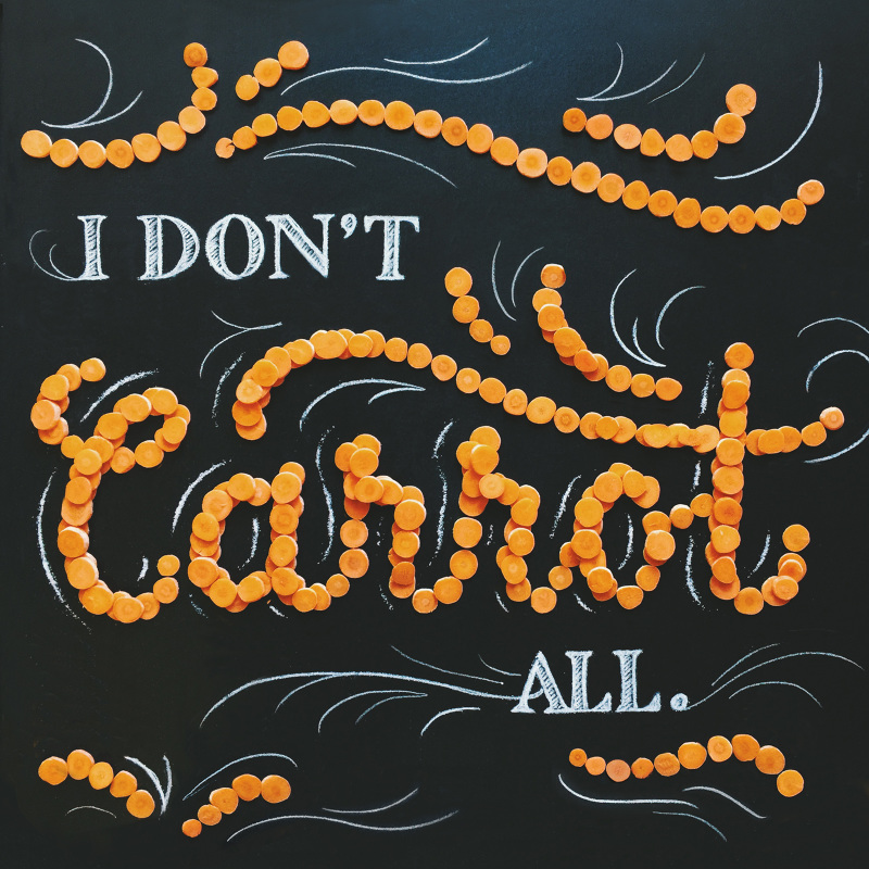
The Christmas holiday image features a pot roast from Denny's—classic comfort food. For the design, I used some of the ingredients of the pot roast meal to create the lettering: salt, carrots, and mashed potatoes with gravy.

Click the play button below to watch the timelapse.
A video posted by Becca Clason (@beccaclason) on Dec 24, 2015 at 9:29pm PST


The Erwin Penland team wanted the New Year design to be super sweet, utilizing many of the dessert toppings from Denny's, so I used strawberry topping, apple/brown sugar crumble, whipped cream, sprinkles, maraschino cherries, caramel sauce, and nuts to create a design that makes your teeth hurt.
To show some of my process, below are rough preliminary sketches that I delivered to the team as well as some close-up detail photos.


BIG CARTEL

$
0
0
Big Cartel asked me to create a lettering installation for the autumn season at their pop-up shop space in downtown Salt Lake City. The wording was "Color Us Proud", because Big Cartel wanted the installation to show local creators and artists that they supported them and were proud what they were doing.

I used fall-colored fabric and sweaters, scarves, beanies, and gloves in similar colors for layering and texture, and I arranged them to look like they were blowing in the wind. I included rain boots, umbrellas, and autumn leaves as props and painted "Us Proud" on a board beneath the word "Color".

Copywriting: Dan Christofferson
Community Coordinators: Sarah Anderson & Dan Christofferson


Viewing all 110 articles
Browse latest View live